Monitoring for Optimal
Wine Grape Growth
This project is about my very first experience in UX, how I handled the project and identifying the mistakes I made.
The Vision
Many factors can affect the fate of delicate wine grapes and a poor harvest can be devastating for small-scale and local farmers. Many farmers currently reference farmer’s almanac, or hoping that your local meteorologist will get the forecast.
VinSense is web application that uses proprietary methods to monitor and assess wine grape growth and health. VinSense gives farmers a holistic picture of what is affecting their grapes and helps to inform the appropriate steps to protect them from harm.
My Role & Responsibilities
As UX student, this was my first ever UX project. Even in this position, I quickly stepped up to lead my team of fellow students.
Led client session to gather requirements and feedback
Led overall design process in research, design, and testing
The Challenges
The biggest challenge was the uncertainty and unfamiliar. How can I make sure that I do well on this project, not just for my grade but also for my client?
“How can I find customers and subject matter experts on grape growing?”
I was 19 years old and stuck in the middle of Indiana. Wineries were far and few and I lacked resources to reach them. I turned to the college of agriculture and spoke with horticulture professors and students who had experiences in viticulture. This also generated some leads in which I was able to Skype call grape growers in California for their feedback and insights.
“How do I know I’m on the right track and doing the right things?”
I defaulted to action and transparency between our team and the stakeholders. At every step and decision, I made it clear as to why I wanted the team to pursue an activity or design iteration. This helped to rationale and thinking about each activity instead of going in on a whim.
“We know nothing about this industry, process, or even drink wine for that matter. How can we improve this experience in a meaningful way?”
My team and I spent a lot of time reading articles, watching videos, and learning from customers about the process of grape growing and wine-making. This helped to provide a foundation of terminology and basic understanding to help craft interview questions later on.

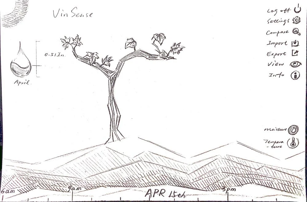
I recreated this timeline graphic with just slightly more information, but the overall look and feel is the same. I wanted to preserve the original design as much as possible for authenticity purposes.
My Design Process
Learning & Understanding
I worked closely with customers, subject matter experts and stakeholders to understand frustrations, system processes, and must have requirements. I created research plans and strategies, led workshops, interviews, and testing sessions to help inform my designs and solve problems.Ideating & Problem-solving
Collaborating between 9 development scrum teams to balance UX research, design, and development in an agile environment, setting realistic expectationsDesigning & Validating
Each set of wireframes balances highly constraining requirements, user research and UX best practicesRelearning & Reiterating
Making revisions based on new understandings and feedback from customers
Research
I led the team through various research efforts, but they weren’t always as fruitful or generative.
Competitive Analysis then - What can we learn from their success and what should we focus on in our product?
My breadth of understanding of competitive analysis was very narrow. We focused mainly on the overall aesthetics, functionalities, and usability on the product. Many of the chosen products did not relate directly to our product but lived within a similar industry.
What I would do now:
If I had a re-do, I’d focus more in-depth on the specific features of the product. I would have looked at each competitor holistically to identify what they do well and also where they fell short. This would have generated a lot more helpful insights than previously.
How does this chosen product connect with the customers?
What are the most loved features and why is it so?

Background Research then - What are the basic of viticulture and how can this help us inform our solution? I felt like I needed to have some knowledge of the space I’m trying to design for. I started with online articles, videos, blogs, and websites to get a basic understanding.
What I would do now:
Today, I still strongly believe that one can’t design something if they don’t understand what it’s supposed to do. I believe that good design is something that is functional and serves a purpose. I would take a similar approach to get at least understand the basic before meeting with stakeholders/users/etc.
User Research then - What’s important to grape growers and how can I capture that sentiment into my designs. From the previous research that the stakeholder had done in addition to speaking with professors/students at the college of agriculture, and Skyping with California grape growers I learned a lot of information. But very little of it could have been used as compelling rationale for certain design decisions made.
What I would do now:
User research isn’t just about what users like or how they interact with a certain product. I began to focus too much on modernizing, data visualization, and aesthetics, tailoring to the modernist user type. This alienated the other user group. It’s about finding a balance between desire, requirements, customers, stakeholders, and what is feasible.


Design
The designs for this project at the time was the most exciting phase. I worked with two really skilled artists who had a natural talent for UI design, but we didn’t know it then.
Ideas
I led the team in brainstorming based on all of our previous findings. Over the course of a few days, we landed with three options.
“Cleanup” - A cleanup of the existing web application, solving for basic UI/UX issues. The was the most boring approach that was meant to serve as a worst case scenario. It was intentionally proposed to the clients in hopes that they would want more and we could find a middle ground with the next approach.

“Tabs” - A tabular approach, based on competitors and how to organize the currently available features. We proposed a tabbed format which would overhaul the structure of the web application to make it more organized, less cluttered, and improve usability.

“Vinualization”- A data visualization approach that focused heavily on aesthetics and design. This was the most exciting and we had dreamed of. This was going all out on design and creating a beautiful product and experience.
This isn’t the first sketch iteration.
Before we went to the stakeholders with these three very different approaches, we had to present these to the rest of the studio. In hindsight, this was the fatal flaw.
I wanted to show everyone else what we were capable of, that we were DESIGNERS and how great the AESTHETICS and the UI was.
We wanted to prove ourselves. And everyone cheered and clapped. They loved the ‘Vinualization’ approach. High from the encouragement and support of our fellow classmates, we marched forward.
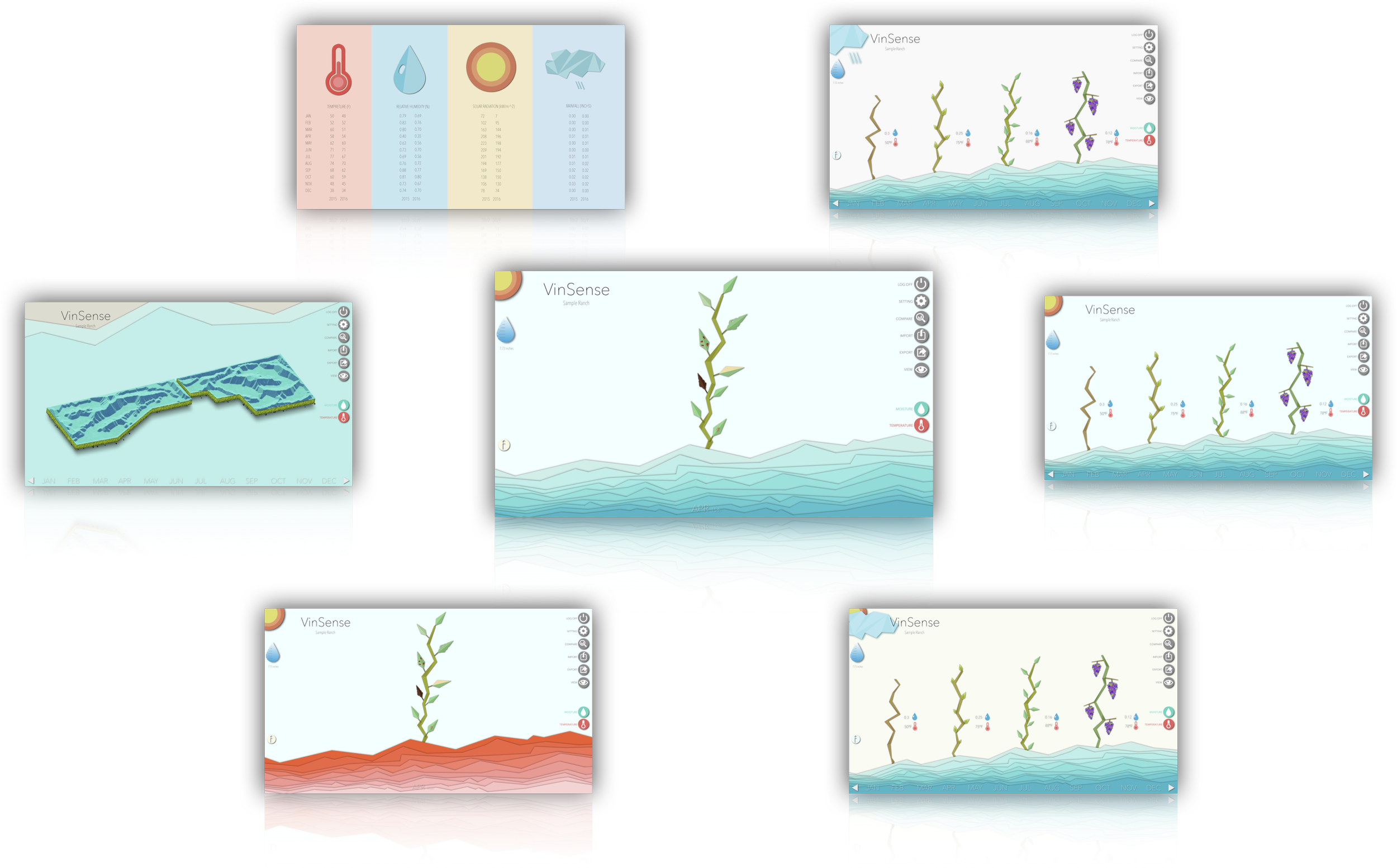
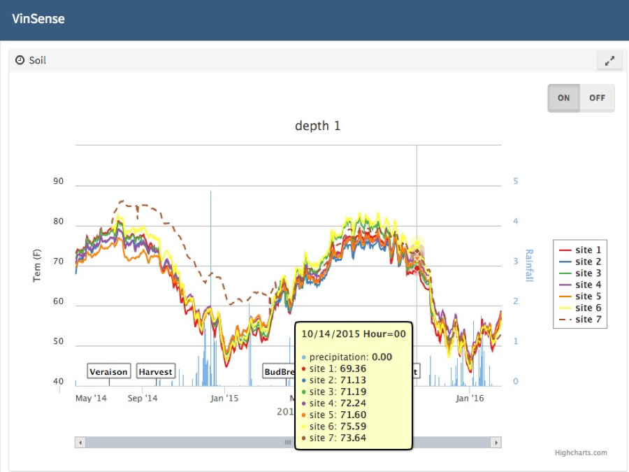
A small series of high-fidelity wireframes that focus on displaying all the data VinSense collects through visualization.
Weather status indicator, a topographic view, leaf health, vine growth, humidity and moisture levels, it was all there. Easily displayed on screen, it would have been perfect for a tablet view.
The final result
Impact & Insights
In the final presentation and hand-off, we expected our stakeholders to be speechless. And they were. They said they liked the idea and it gave them a lot to think about. I took that at face value at the time and enjoyed it with my A grade. But upon reflection after my many experiences, I realize now that they didn’t like it at all.
Very few people would disagree these screens are beautiful. However it alienates a lot of traditional growers and it was way out of the realm of possibility for VinSense to be able to pursue. As my team got excited for the ideation and design phase, we lost sight of what the stakeholders wanted and how to design for an inclusive experience. This was when I learned the difference between UI design and UX design.