Redesigning Payment Kiosk for
Low-literacy populations
This project is about understanding customers, designing for low-literacy, and “selling” the experience
The Vision
Citybase aims to connect everyday citizens to their government through the use of technology to find, apply, and pay for public services. One of the mediums is a payment kiosk strategically located at various payment centers placed throughout the city. These kiosks would allow citizens to pay for permits, taxes, bills, and tickets without needing to wait for a counter clerk. This saves time and reduces the workload of the clerks so they can focus on more complicated requests.
However, kiosks were underutilized and mostly ignored by customers, despite these benefits. My goal was to uncover the reasons as to why customers weren’t interacting with the kiosks. Once known, address these reasons through a UI/UX redesign of the product.
A successful redesign should improve the customer’s experience and increase the business value of the kiosk. Metrics such as time on task, retention rates, and number of completed tasks were key indicators of success.

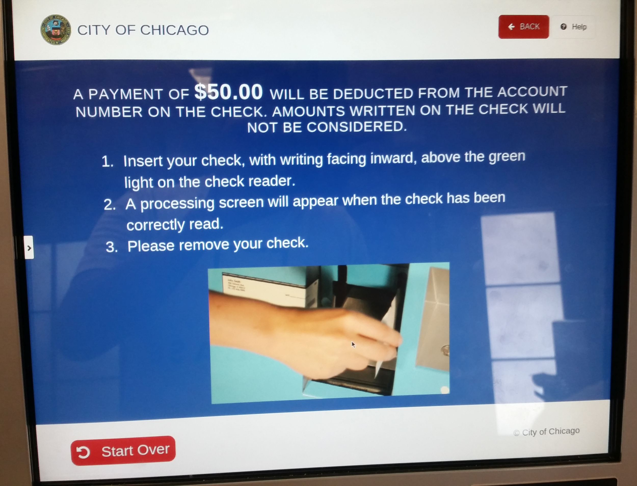
*I was unable to get screenshots of the product as Citybase did not have them available. I made do with the situation and took photos with phone.
My Role & Responsibilities
As UX designer in a team of three, I led portions of user research, ideation, and design.
Customer Interview - planning and facilitation
Contextual Inquiry - planning and facilitation
Shadowing/Observations - planning and synthesis
Usability Testing - led script writing, facilitation, and synthesis
Persona Development - owned deliverable
User Journey Mapping/Storyboarding - owned deliverable
Software Heuristic Analysis - analysis and synthesis
Prototyping - process flows and direction
UI Design - ideation, designs, and iterations
Educate stakeholders and developers on UX theories and principles
Defended and rationalized design decisions to city directors and managers
The Challenges
The biggest challenge comes from designing for the target demographic - low literacy, low tech-savviness populations who are wary of the government. This requires understanding of the fears and frustrations of the customer and really focusing in on user-centered design.
How can I make the product easier to understand and use for those who are less tech-savvy or have difficulty reading English and/or Spanish?
I needed to understand UI best practices for this target demographic. For example using illustrations instead of photorealistic imagery. I needed to make it easy to understand and provide on-boarding and utilize everyday conversational language for better transparency and communication.
“How do I build customer empathy for design rationale and stakeholder agreement?
I created personas and storyboards based on the information and synthesis from field research to build empathy with stakeholders and other interested parties. These helped to clearly articulate the key issues and helped to define the metrics for success.
How can I increase the customer’s awareness of the kiosk and its capabilities?
I needed to understand UI best practices for this target demographic and tackle the core blocker of trust and authenticity of the product. This meant making it very clear from the beginning the purpose, on-boarding, and conversational language for better transparency and communication.

My Design Process
Learning & Understanding
I went to payment kiosks to speak with customers waiting in line to learn about their perception and experiences. From there, I was able to experience first hand in a live environment the frustrations and obstacles customers faced. I conducted a heuristic analysis of the system to solidify my understanding of the experience gaps.
Empathy Building & Buy-in
It was important to get stakeholder buy-in because it wasn’t just a few simple issues. At the same time Citybase worked with government officials on setting a timeline. I needed to present my findings and build empathy to really demonstrate the experiences everyday customers were going through. This was done through personas and storyboarding, which was highly effective.
Designing & Validating
Taskflows and heuristics served as sort of a roadmap along with user research data. I started with paper sketches to be able to quickly validate with users and make fast iterations.
Reiterating & Prototyping
Once the sketches were validated, I moved onto creating high fidelity wireframes and prototyping. Once the finished prototype was built in Adobe XD, we tested with 8 users and got excellent results.
Research
Initial research efforts occured at payment centers spread throughout the center. I visited 4 different sites and spoke with customers and staff. The goal was to understand 1) the customers and 2) the kiosk itself.
Customer Interviews & Observations
I spoke with the customers in the real-life context was an eye opening experience. The first hour I simply observed the environment, interactions, and processes. I then, spoke with customers waiting in line and those that attempted to use the kiosk. There was so much anger and frustration with how long the lines were in order to pay their tickets. Many customers only had a small window of time (their lunch break) to pay their tickets/bills because they had other obligations after work. Some customers didn’t even know about the kiosk or were intimidated by it.
Heuristic Analysis
Interacting with the kiosk in a live environment was a key moment to connect with customers and understand their frustrations. Whether it’s confusing language, unable to proceed forward, or just needing some help, there were many apparent UX errors. It was during this time, that I took photos of the UI and took it back to home-base to do a heuristic analysis.
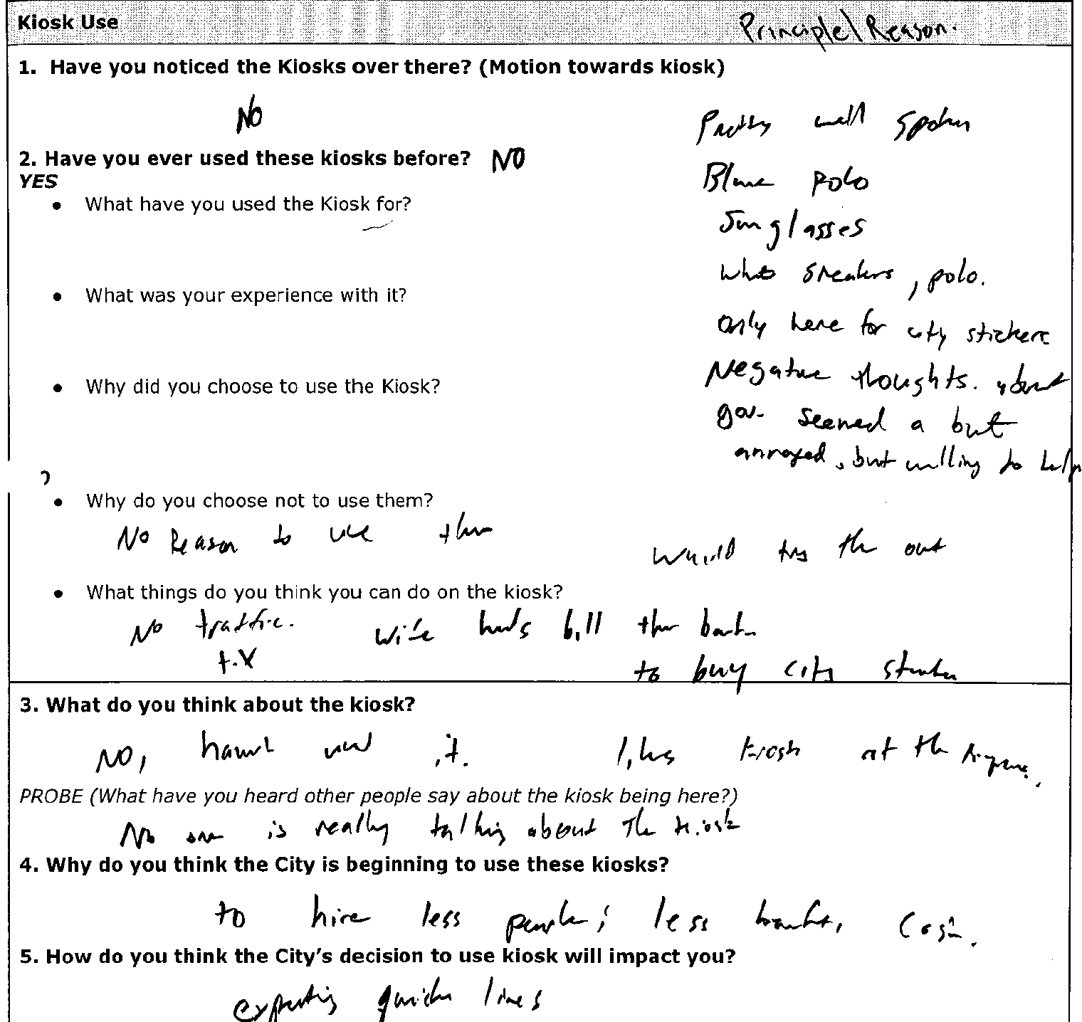


My ‘chicken scratch’ notes as I jot down key points while interviewing with customers.
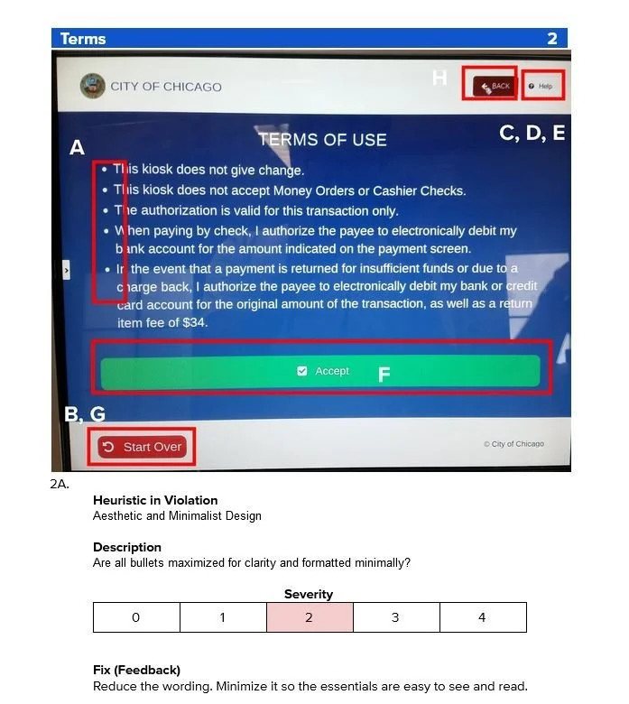
Heuristics based off of Nielsen’s 10 Usability Heuristics for UI Design.
The appropriate area was highlighted and labeled along with a brief description of the heuristic. A severity rating was also provided to help the design and development team prioritize which issues to address first.
Personas & Storyboards
With the vast amount of user data my team and I collected, my next step was to create user personas. For this specific situation, I created five persona archetypes. This is due to being able to identify several '“tertiary” type persons who are not the target audience, but nevertheless still use the kiosk and are customers.
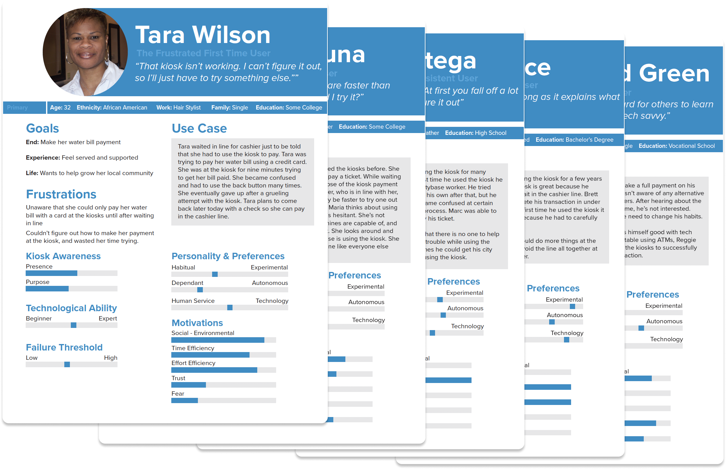
Tara is the primary persona, who represents a majority of the kiosk users I interviewed/observed. She is made aware of the kiosk and its capabilities AFTER she has waited in line and was redirected to it by the counter clerk. Shortly after interacting with it, she’s unable to complete her transaction and leaves frustrated.
Tara’s story is one of the most prevalent situations that occur. Where customers have a slight deviation from their normal process and are introduced to the kiosk. They are usually met with a confusing experience and unable to get the help they need. This creates a frustrating experience for them and they ultimately feel like they’ve wasted their time.
This is one of the three storyboards I created, which helped to highlight the every day struggles of everyday citizens paying their dues. It was immensely use when presenting it as a curation of our user research findings and sharing that with municipal leaders and Citybase stakeholders for their buy-in and commitment.
“ …I would just touch it [the screen] with my knuckles… I don’t want them to get my fingerprints…”
Design
The designs for the kiosk focused on applying what we had learned from our user research as well as best practices for designing for low-literacy, low tech-savviness populations.
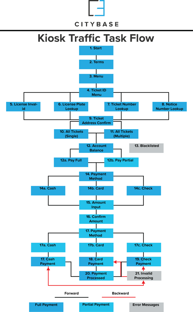
Taskflow
I first created a taskflow to serve similiarly to a sitemap. This was to document all the screens that were currently present in the live kiosk. From there, I optimized the path by reducing barriers, pop-ups, and other redundancies. I focused on creating a straightforward, easy to understand “happy” path. Once optimized, the taskflow then served as an inventory of screens to be designed.
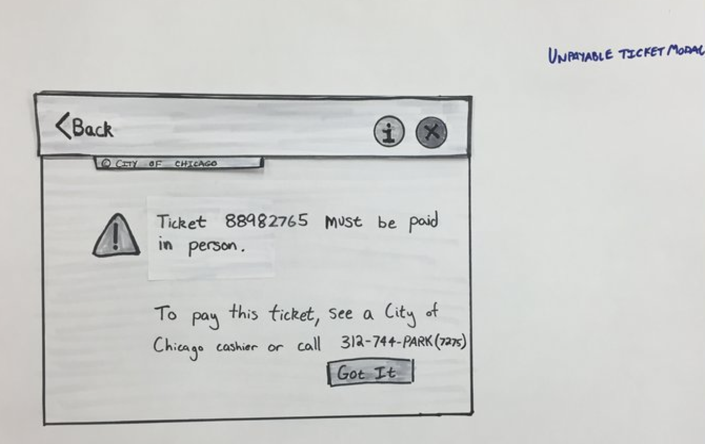
Low-Fidelity - Using sketches allowed me to work quickly and try different iterations. This is a representation of the cleaned up sketches, which were shown to customers to get valuable quick feedback. Their feedback was captured and incorporated into the final high fidelity designs.
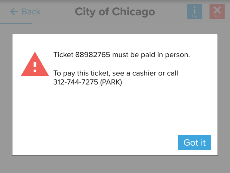
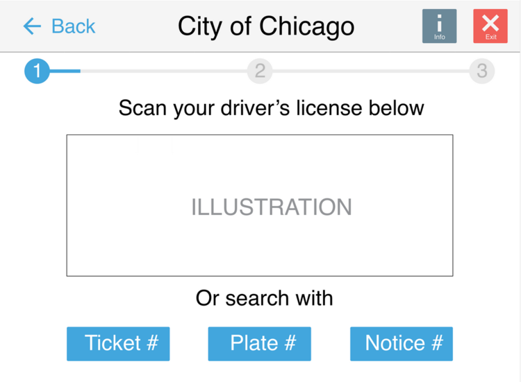
High Fidelity - The final designs focused on a straight forwards, one step at a time flow, that is easy to understand. We chose to keep it minimal with enlarged fonts to make it easier to understand for low-literacy users. These screens were used to prototype the experience and conduct final usability testing.

Usability Tests & Results
When testing the final prototype, I spoke with a total of 9 customers in a semi-structure usability test. They had to complete a series of tasks which involved completing a transaction with the various different payment methods. There was a wide range of customers from a variety of different backgrounds, ethnicities, and ages.
Overall results of the usability tests showed promising results.
100% of participants completed their second task faster than their first, suggesting a degree of learnability.
100% of participants were able to complete all their tasks without fail.
The average completion time was ~2-3 minutes.
There were very few and minor usability/navigation issues, which were addressed.
The interaction and process was intuitive and “easy to understand”
Impact & Insights
Within the first year of kiosk 2.0 being released based on my research and designs, Citybase reported the following metrics. Kiosks were now highly efficient, cutting down transaction time by 400%, from 8 minutes to just under 2 minutes. Within it’s first year, the kiosks generated over $9 million in transaction revenue and found that once customers started using the kiosk, over 90% of them returned to the kiosk for their next transaction. Partly due to these successes, Citybase was acquired by GTY Holdings shortly after in 2018 for $160 million.
400%
improvement for time on task
$9+ millions
of transaction revenue
90%
retention rate of returning customers.